Interactive Visualization with Bokeh
Visualization is absolutely essential in data analysis, as it allows you to directly feed your data into a powerful neural network for unsupervised learning: your brain. Learn how to use bokeh to dig deeper in your data!
Introduction
Visualization is absolutely essential in data analysis, as it allows you to directly feed your data into a powerful neural network for unsupervised learning: your brain.
It will allow you to find features and issues in your dataset. And when you find something, you want to be able to investigate further right away. That's where interactivity is a must.
So far in this blog, we've relied mainly on jupyter notebooks and matplotlib. That's already quite interactive, since you can modify your plots by editing a cell, or add new cells to create more detailed plots.
But bokeh will bring us a whole new set of possibilities. For example, it can be used in a jupyter notebook for truly interactive plotting, and it can display big data. We can even set up a bokeh server to display data continuously in a dashboard, while it's being recorded.
In this post, I'll just give you a short demo. You will learn how to:
- install bokeh on your computer
- do basic plots
- create an interactive plotting system with a user interface (featuring a button!)
And all the plotting will be done in a jupyter notebook.
Let's get started with the installation!
Installation of bokeh
As usual, we will install all the needed tools with anaconda. If not yet done, install anaconda .
Then, create an environment for this tutorial. We name the environment bokeh, and require several packages: bokeh of course, but also pandas, matplotlib, and jupyter.
conda create -n bokeh bokeh pandas matplotlib jupyter
That's it! You can now activate this environment:
conda activate bokeh
If you wish, you can run this tutorial on your computer. Or you can simply just read through here.
To run the tutorial, download t his jupyter notebook as bokeh_intro.ipynb. To do that, you could do File > Save As ... in your browser, or use the command line tools curl or wget. Then, start the notebook:
jupyter notebook bokeh_intro.ipynb
You should be directed to the notebook in your browser, and you can keep following this tutorial over there.
Matplotlib limitations
Let's start by importing the tools we need:
import numpy as np
import matplotlib.pyplot as plt
%matplotlib inline
np.random.seed(0xdeadbeef)
Then we create a sample of (x,y) points. In this sample, 100 points are drawn from a Gaussian distribution centred at (0,0) with a width of 1. On top of this, we add 100 points drawn from another Gaussian distribution centred at (1,1), with a width of 0.05.
sample1 = np.random.multivariate_normal([0,0], [[1,0],[0,1]], 100)
sample2 = np.random.multivariate_normal([1,1], [[0.05,0],[0,0.05]], 100)
sample = np.concatenate([sample1, sample2])
plt.scatter(sample[:,0],sample[:,1])
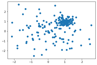
Since the number of points is not too large, we clearly see the two distributions. But let's add more points now.
sample1 = np.random.multivariate_normal([0,0], [[1,0],[0,1]], 5000)
sample2 = np.random.multivariate_normal([1,1], [[0.05,0],[0,0.05]], 5000)
sample = np.concatenate([sample1, sample2])
plt.scatter(sample[:,0],sample[:,1])
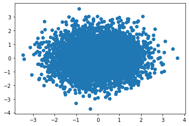
And we just get a blob of mess, no way to see the two distributions. Of course, it's possible to tune our plotting options:
plt.figure(figsize=(10,10))
plt.scatter(sample[:,0],sample[:,1], alpha=0.5, marker='.')
That's much nicer!
Still, the plot is static. No way to zoom nor to get some information on these points. That's where bokeh will really help.
First visualization with bokeh
Let's import some tools from bokeh and initialize it:
from bokeh.io import output_notebook, show
from bokeh.plotting import figure
output_notebook()
Then, we can do a simple plot with:
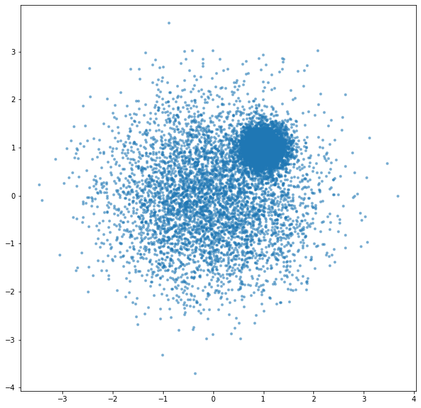
tools = "hover, box_zoom, undo, crosshair"
p = figure(tools=tools)
p.scatter(sample[:,0], sample[:,1], alpha=0.5)
show(p)
What is very nice is that we can now hover on the data to get some information:
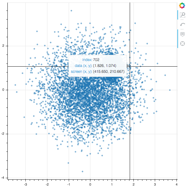
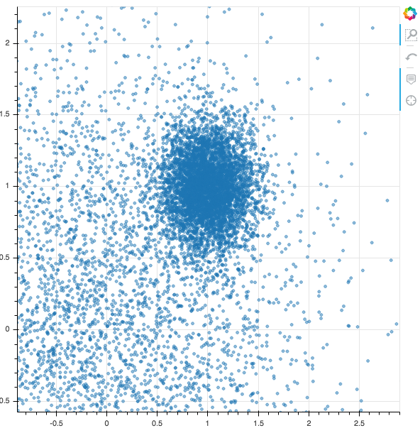
And we can do a box zoom to focus on the narrow gaussian distribution:
Bokeh and pandas
The integration between bokeh and pandas works very well. In this section, we will use pandas to add another value to each data point, and we will see how to modify the bokeh tooltip to show this value while hovering.
First we're going to import:
- pandas: we will create a pandas dataframe from the numpy array holding our sample, so that we can add a new value to each point.
- the bokeh ColumnDataSource: it will act as a convenient interface beteween bokeh and the dataframe.
- the bokeh HoverTool: we'll need it to change the format of the tooltip
from bokeh.models import ColumnDataSource, HoverTool
import pandas as pd
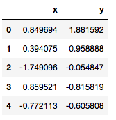
Then, we create the dataframe from our sample, and we print the first rows:
df = pd.DataFrame(sample, columns=('x','y'))
df.head()
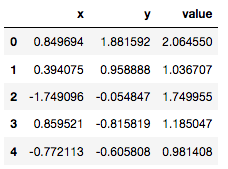
Let's now add a new value to each point, and print again. As an example, I put here the distance of the point from origin, but this value could be anything; it does not have to be a function of x and y.
df['value'] = np.sqrt(df['x']**2 + df['y']**2)
df.head()
And finally, we do another plot, with a custom HoverTool:
source = ColumnDataSource(df)
tools = "box_zoom, undo, crosshair"
p = figure(tools=tools)
p.scatter('x','y', source=source, alpha=0.5)
p.add_tools(
    HoverTool(
        tooltips=[('value','@value{2.2f}'),
                  ('index', '@index')]
    )
)
show(p)
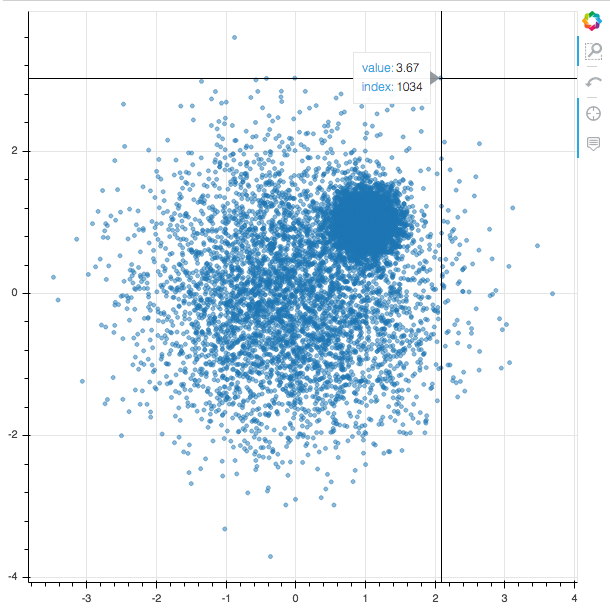
Using the index given by the tooltip, we can locate the corresponding row in the dataframe:
df.loc[1034]
Bokeh Graphical User Interface
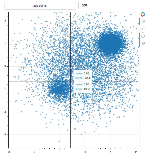
Now that we master the basics, let's try something a bit more involved. We will do the exact same plot but this time, the user will be able to click a button to add a number of points to the sample.
from bokeh.layouts import grid
from bokeh.models import Button, TextInput

def modify_doc(doc):
    # same as before
    source = ColumnDataSource(df)
    p = figure(tools=tools)
    p.scatter('x','y', source=source, alpha=0.5)
    p.add_tools(
        HoverTool(
            tooltips=[('value','@value{2.2f}'),
                      ('index', '@index')]
        )
    )

    # this function is called when the button is clicked
    def update():
        # number of points to be added, taken from input text box
        n = int(npoints.value)
        # new sample of points to be added.
        # we use the a narrow gaussian centred on (-1, 1),
        # and draw the requested number of points
        sample3 = np.random.multivariate_normal([-1,-1], [[0.05,0],[0,0.05]], n)
        df_new = pd.DataFrame(sample3, columns=('x','y'))
        df_new['value'] = np.sqrt(df['x']**2 + df['y']**2)
        # only the new data is streamed to the bokeh server,
        # which is an efficient way to proceed
        source.stream(df_new)

    # GUI:
    button = Button(label='add points:')
    npoints = TextInput(value="50")
    button.on_click(update)
    # arranging the GUI and the plot.
    layout = grid([[button, npoints], p])
    doc.add_root(layout)

show(modify_doc)
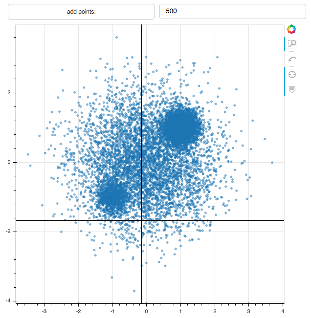
I obtained the plot above after editing the number of points to add 500 points everytime I click the "add points: " button, and clicking this button twice.
Exercise: you could modify the macro above such that new points are added to the plot automatically every second without you clicking on the button. For that, use the add_periodic_callback method of the doc object.
Conclusion and outlook
In this article, you have learnt how to:
- install bokeh on your computer
- do basic plots
- create an interactive plotting system with a user interface
I hope this short demo convinced you that bokeh is really easy and can be a very nice addition to your data analysis arsenal.
In the next post, we will see how to setup a stand-alone bokeh server without the jupyter notebook, and how to use it to display data added to a database in real time.
Read more about visualization
- Data pipeline with Docker, InfluxDB, and Grafana : full data pipeline for IOT, experimental science, or the industry. You’ll get an introduction to excellent tools: docker for virtualization, InfluxDB as a time-series database, and Grafana as a multi-purpose dashboard server.
- Show your Data in a Google Map with Python : study real-estate price in France near Geneva on a Google Map, with pandas and bokeh.
- Choropleth Maps in Python : Learn how to do choropleth maps (colored maps with political or physical boundaries) avec geoviews et geopandas.
Please let me know what you think in the comments! I’ll try and answer all questions.
And if you liked this article, you can subscribe to my mailing list to be notified of new posts (no more than one mail per week I promise.)
Learn about Data Science and Machine Learning!
You can join my mailing list for new posts and exclusive content: