An introduction to clustering
Learn how to use clustering to find categories in unlabeled datasets, with python and scikit-learn
Clustering is an unsupervised machine learning technique with a very wide range of applications in many fields, from Physics or Biology to marketing or surveillance.
Given an unlabelled dataset of samples, clustering algorithms find similar samples and group them into clusters.
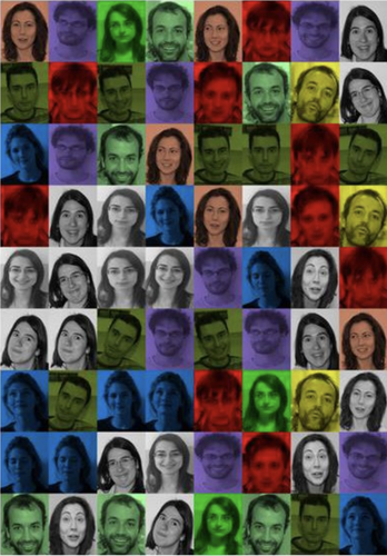
For example, in a dataset of faces, clustering can find the images that might correspond to the same person, as illustrated below [Rodriguez and Laio, Science 344 (6191), 1492-1496]. In this figure, images belonging to the same cluster are displayed with the same color.
In marketing, clustering is often used to "segment" customers into different profiles. If you're selling cars, you're not going to propose the same product to 25 years old women and to 50 years old men.
If you only want to consider gender and age, you can easily segment your customers by hand. But there may be many other variables to consider: income, home address, behaviour on your website, ... With more variables, the segmentation becomes more accurate, but also much more difficult to perform. Clustering algorithms can handle many variables and make it possible to precisely define market segments.
For this post, I've selected three clustering algorithms that I often use : K-means, DBSCAN, and agglomerative clustering with Ward linkage.
You will learn:
- how the K-means, DBSCAN, and Ward clustering algorithms work,
- how to perform clustering on simple datasets with only a few variables, and on more complicated datasets such as images,
- how to use dimensionality reduction to improve clustering performance.
Let's start by discussing the three clustering algorithms.
Then, we will see how to run clustering in python with scikit-learn, which provides an implementation for all the algorithms we need.
K-means
K-means is perhaps the most widely used clustering algorithm at the moment, because it can scale to very large datasets as long as the number of clusters is not too large.
Let's consider a dataset of $N$ samples $x_i$. Each sample corresponds to an individual measurement of a number $D$ of variables. So the dataset space has $D$ dimensions, and each sample is a point in this space. In other words, the $x_i$ are vectors of $D$ components.
K-means has only one parameter, the number of clusters $K$ that we wish to reconstruct, hence the name K-means.
So first, we need to decide on this number. That's actually easier said than done, because in practice, we often don't know how many clusters we're supposed to reconstruct in the dataset... We'll come back to this.
The cluster positions, or their "centroids", are denoted $\mu_j$ and are also vectors of dimension $D$.
K-means is an expectation-maximization algorithm, in which the cluster centroids are estimated iteratively.
Initially, the centroids can be randomly positioned in the dataset space.
Then, we iterate, performing the following operations at each step:
- each sample is assigned to the cluster with the closest centroid.
- for each cluster, the centroid is re-calculated as the average of the positions of all samples in the cluster.
The iteration stops when the assignments no longer change. The algorithm is nicely illustrated on Wikipedia:
Now please take the time to experiment with K-means in a simple case.
K-means performs a Voronoi tessalation of the dataset space. Indeed, by construction, each sample ends up associated to the closest centroid. So the algorithm partitions the dataset space with hyperplanes (which are simply lines in 2D, or planes in 3D).
This is very important to understand the features and limitations of this algorithm. Here are just two examples, based on simple 2D datasets from the link above.
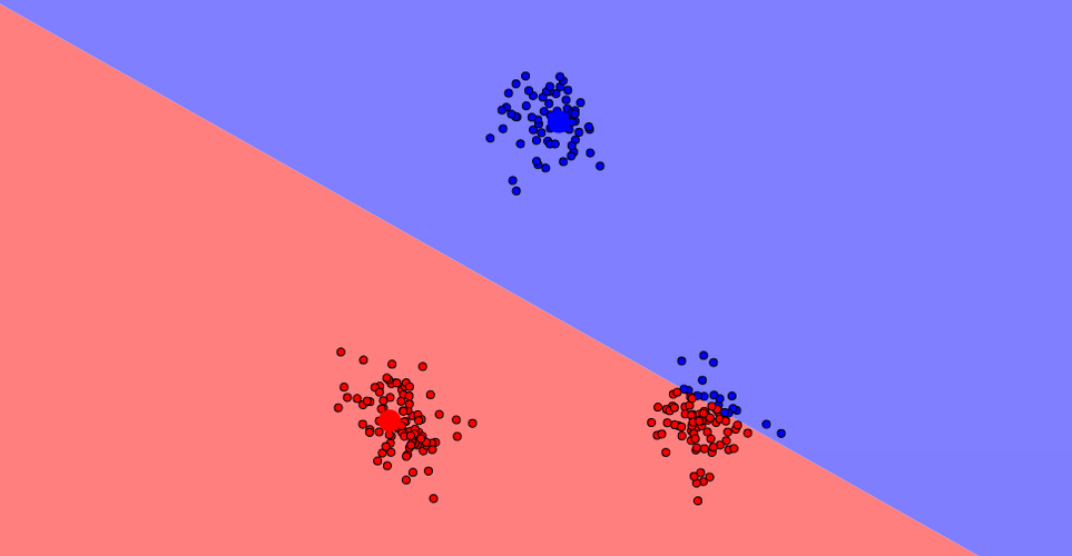
K-means is very sensitive to the parameter K
In the following picture, we can see three clusters. If we choose K=2, the algorithm converges but the two clusters don't make sense:
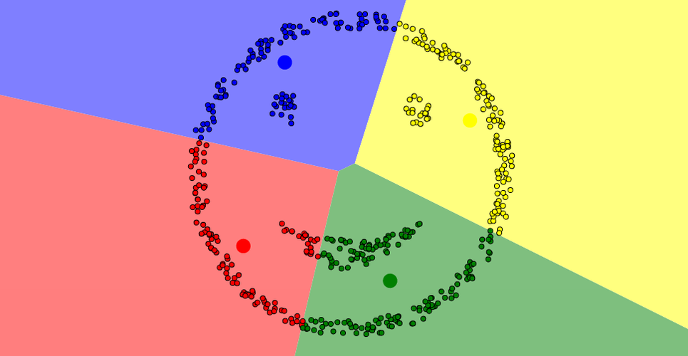
K-means is adapted to compact and convex distributions
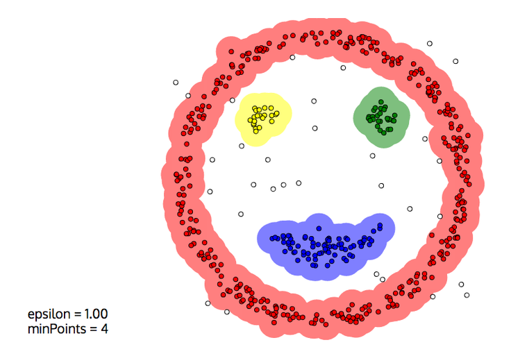
In the example below, we can see four clusters: the eyes, the mouth, and the outline of the face. Even if we correctly choose K=4, it's impossible for K-means to reconstruct the clusters properly:
DBSCAN
DBSCAN (Density-Based Spatial Clustering of Applications with Noise) reconstructs clusters from dense group of points, and is mostly insensitive to the shape of the point distribution.
The algorithm has two parameters:
- a maximum distance $D$,
- a minimum "density" $N$ (actually that's a minimum number of points, not a density.)
The algorithm starts on a point, and finds a number $n$ of other points within the distance $D$.
- If $n \geq N$:
- the new points are aggregated
- the algorithm is repeated for the new points
- Otherwise, we start again on another point
Please take some time to experiment with DBSCAN.
This time, the smiley face above is correctly reconstructed (In this picture, $D$ and $N$ are called epsilon and minPoints, respectively:)
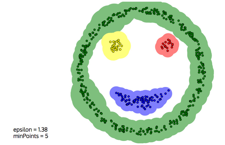
Also, DBSCAN is able to leave noise unclustered, which is often desirable:
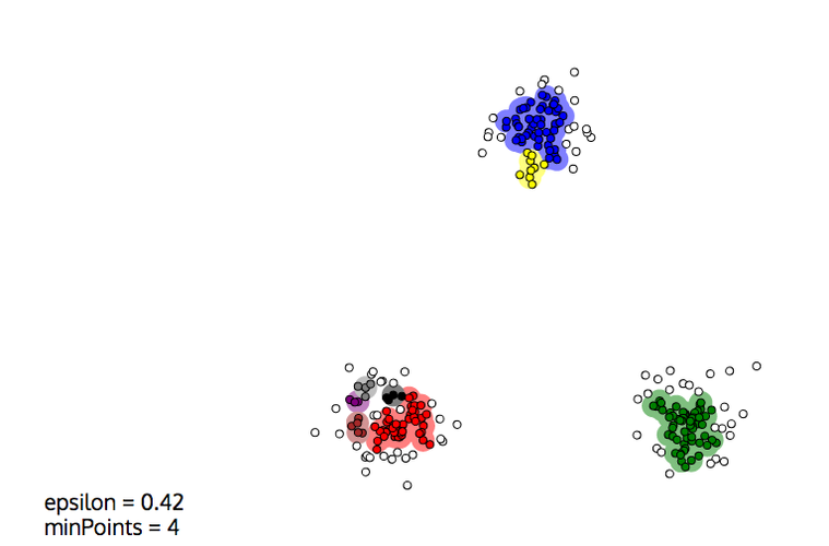
But DBSCAN also has drawbacks, and its behaviour very much depends on the two parameters $D$ and $N$:
- Close clusters can easily get merged, e.g. two blobs that touch each other.
- Because of statistical fluctuations in the density, a blog can be split into several clusters
The second effect is illustrated below. For such Gaussian blobs, K-means would do a better job, even if they were closer. But of course, only with the proper value of $K$. DBSCAN could also work well, with a larger $D$ or a smaller $N$.
Hierarchical clustering
Hierarchical clustering algorithms build nested clusters by merging them or splitting them iteratively, until the required number of clusters is obtained:
- agglomerative algorithms start with one cluster for each sample in the dataset, and sequentially merge clusters into larger clusters. In this post, we're going to focus on this case.
- divisive algorithms start with a single cluster for the whole dataset, and split clusters into smaller clusters.
The algorithm stops when the required number of clusters is obtained.
The cluster hierarchy is represented by a graph called a dendogram:
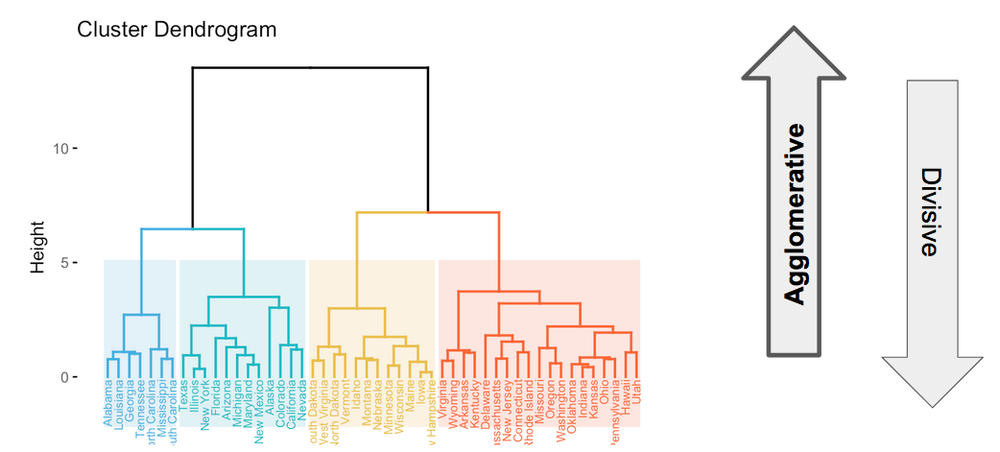
This image presents the clustering of the united states of America based on some criteria.
In agglomerative clustering, the algorithm starts with a cluster for each state. For each merge, the height shows at which step the merge took place in the agglomerative sequence.
For example, we see that the algorithm started by merging the Iowa and New Hampshire clusters. Then, it merged some other states, before merging the Maine cluster with the Iowa+New Hampshire cluster.
The merging sequence is defined by a linkage criterion.
There is a family of linkage criteria in which the next two clusters to be merged are the closest ones:
- Single linkage: the distance between two clusters is defined as the minimum distance between any sample in the first cluster, and any sample in the second.
- Maximum linkage: the distance is defined as the maximum distance between samples in the two clusters.
- Average linkage: the distance is taken to be the average distance between samples in the two clusters.
The Ward linkage, on the other hand, minimizes at each merge the increase of the total within-cluster variance.
What does this mean?
First, we need to define the variance.
Within a given cluster $j$, the variance $\sigma_j^2$ is the average squared distance of the cluster samples to the cluster position. It is defined as
$$\sigma_j^2 = \frac{1}{n_j} \sum_{i=1}^{n_j} (x_i - \mu_j)^2,$$.
In this expression, $n_j$ is the number of samples in the cluster, and the sum runs over all samples. In the sum, $x_i$ and $\mu_j$ are the positions of sample $i$ and the cluster, respectively. So $x_i - \mu_j$ is the vector going from the cluster centroïd to sample $i$.
Then, the total within-cluster variance is defined as $\sum \sigma_j^2$, where the sum is done for all clusters.
At the beginning, the total intra-cluster variance is 0. The first clusters to be merged are therefore the two closest samples.
Afterwards, merging proceeds by merging the two clusters that lead to the minimum increase of the total intra-cluster variance, until the required number of clusters is met.
Running this tutorial
After this short primer on clustering, we're ready to give it a try with python and scikit-learn!
To run the next parts of this tutorial, the easiest is to use Google Colab by simply clicking on this link. You'll be able to execute the code on your own, and to modify it.
If you want to run on your own computer, first Install Anaconda for Machine Learning and Data Science in Python, and install the necessary packages in your conda environment
conda install jupyter scikit-learn matplotlib
Then start a jupyter notebook, and load this notebook. The source notebook can be found on github here if you want to download it, but you can also just copy/paste the cells in an empty notebook.
Clustering a Basic Dataset
In this section, you will learn how to use scikit-learn to:
- generate a toy dataset,
- run clustering algorithms,
- evaluate the performance of clustering algorithms.
Generating a Toy Dataset
First, generate the toy dataset with the handy make_blobs function from sklearn.datasets:
import sklearn.datasets
data, labels = sklearn.datasets.make_blobs(n_samples=1000, random_state=123)
We require 1000 points in total, and specify an integer as random_state to get reproducible results.
Let's get more information on the dataset:
import numpy as np
print(data.shape, labels.shape)
print(np.unique(labels))
We see that, by default, we have:
- 1000 samples in total, each of them with two variables, x and y, as requested.
- three classes of samples, automatically labelled to 0, 1, and 2.
Now, plot the sample distribution, using the label value as colour:
import matplotlib.pyplot as plt
plt.scatter(data[:,0], data[:,1], c=labels, alpha=0.3)

In each blob, the samples follow a 2D normal distribution. They might not look very circular in the plot above because the axis scales are not exactly the same.
Note that you can ensure reproducible results by specifying an integer as random_state, as I did above.
You can also specify the number of clusters you want, their size, the number of features (or dimensions) of your dataset, and the position of the cluster centers. Check the documentation of make_blobs, and let's do all this to create a 3D dataset:
data, labels = sklearn.datasets.make_blobs(
    n_samples=500,
    n_features=3,
    centers = [
        [0, 0, 0],
        [2, 2, 0],
        [1, 1, 5]
    ],
    cluster_std = [0.2, 0.2, 1],
    random_state=1234
)
import mpl_toolkits.mplot3d.axes3d
fig = plt.figure(dpi=90)
ax = fig.add_subplot(111, projection='3d')
ax.scatter(data[:,0], data[:,1], data[:,2], c=labels, alpha=0.3)

Ok, let's go back to our 2D dataset, and try to do some clustering!
data, labels = sklearn.datasets.make_blobs(n_samples=1000, random_state=123)
plt.scatter(data[:,0], data[:,1], c=labels, alpha=0.3)
Clustering with scikit-learn
Scikit-learn provides a unified interface to widely-used clustering algorithms. In this section, we will try a few of them.
We start with K-means, specifying that we want to reconstruct three clusters:
from sklearn.cluster import KMeans
kmeans = KMeans(n_clusters=3, random_state=1).fit(data)
That's it! the clustering is done already, and the cluster assignments are available in kmeans.labels_:
print(kmeans.labels_.shape)
print(kmeans.labels_[:10])
Let's see the results. We plot the full dataset again but this time, we color the points according to the assigned cluster:
plt.scatter(data[:,0], data[:,1], c=kmeans.labels_, alpha=0.3)

Not bad! Even the two closest clusters are rather well reconstructed.
Questions and exercises:
- why are the colors of two clusters inverted?
- the boundary between the two clusters on the right side looks like a straight line. Do you know why?
- repeat the clustering several times, asking different numbers of clusters.
Now let's try an agglomerative clustering with Ward linkage, which is the default:
from sklearn.cluster import AgglomerativeClustering
ward = AgglomerativeClustering(n_clusters=3).fit(data)
plt.scatter(data[:,0], data[:,1], c=ward.labels_, alpha=0.2)

We end up with asymmetric clusters on the right side.
This is due to the fact that agglomerative clustering algorithms are greedy, which means that a growing cluster keeps growing unless something stops it. The Ward linkage is designed to regulate this effect, but some imbalance usually remains for close clusters, as we see above.
Exercises
- Repeat the hierarchical clustering with the single linkage criterion. Check the documentation of AgglomerativeClustering to see how to do this technically.
- Can you explain what happened? The Wikipedia article on Single-linkage clustering might help you.
- Try the DBSCAN algorithm. Can you find a way to optimize the
min_samplesandepsparameters to separate the two close clusters?
Clustering performance
Quantifying the performance of a clustering algorithm is not as obvious as it seems.
First, and most importantly, one needs to know the ground truth, that is the true label for each sample.
But in practice, clustering is applied in the context of unsupervised learning, because the ground truth is not available. So to quantify performance, one usually needs to resort to manual labeling to define the ground truth for at least part of the dataset.
So let's assume we have the ground truth.
The second question is: How to define a performance metric?
Intuitively, a good clustering should have the following properties:
- homogeneity: each cluster only features samples of a single class.
- completeness: all samples from a given class should end up in the same cluster.
Scikit-learn provides an implementation for the homogenity and completeness scores. Let's evaluate them for the kmeans and ward clustering we have performed above:
from sklearn.metrics.cluster import homogeneity_score, completeness_score

def scores(true_labels, clustering):
    homogeneity = homogeneity_score(true_labels, clustering.labels_)
    completeness = completeness_score(true_labels, clustering.labels_)
    return homogeneity, completeness
scores(labels, kmeans)
scores(labels, ward)
Both the homogeneity and completeness scores are bounded by 0 and 1, and 1 is perfect.
Here, we see that the two algorithms perform well, and have similar performance.
I'm not giving you the definition of homogeneity and completeness here, as this would bring us too far. Indeed, one cannot understand these concepts without a good understanding of information entropy. If you're interested, I suggest you to have a look at these excellent articles, in this order:
- An easy and visual introduction to information theory and entropy: C. Olah, on his blog.
- Definition of the homogeneity and completeness based on entropy: A. Rosenberg and J. Hirschberg, "V-Measure: A Conditional Entropy-Based External Cluster Evaluation Measure", EMNLP-CoNLL 2007 Proceedings, available here.
- What is entropy? C. E. Shannon, "A Mathematical Theory of Communication", Bell System Technical Journal 27 (3): 379-423, available here
Finally, another thing that can be done it to compute the confusion matrix between the true and cluster labels. For K-means:
from sklearn.metrics import confusion_matrix, ConfusionMatrixDisplay
km_matrix = confusion_matrix(labels, kmeans.labels_)
km_matrix
In this matrix, the lines correspond to the true labels, and the columns to the cluster labels. For example, there are 334 samples with true label 0, and among them, 302 are reconstructed with cluster label 2, and 32 with cluster label 0.
We can do the same for Ward:
from sklearn.metrics import confusion_matrix, ConfusionMatrixDisplay
wd_matrix = confusion_matrix(labels, ward.labels_)
wd_matrix
We can print the size of each reconstructed cluster by summing up the numbers in each column of the matrix:
km_matrix.sum(axis=0)
wd_matrix.sum(axis=0)
The confusion matrix tells us a lot about the two close clusters on the right side. Visually, we have seen that the Ward algorithm produces asymmetric clusters. And your eyes might have fooled you into thinking that the two clusters have different sizes. But that's not the case! The imbalance in size between the two clusters is the same with both algorithms. What happens with Ward is that the bottom cluster eats up the center of the top cluster, but the top cluster recovers on the sides.
This also explains why the homogeneity and completeness scores were so similar.
In conclusion and as always in data analysis: don't trust the visualization.
Now, let's try with a much more complicated dataset!
Clustering the MNIST handwritten digits dataset
We start by downloading the full MNIST dataset:
from sklearn.datasets import fetch_openml
raw_data, raw_labels = fetch_openml('mnist_784', version=1, return_X_y=True)
The dataset features 70 000 handwritten digits images, with 28x28 = 784 pixels with a single greyscale channel.
print(raw_data.shape)
print(raw_labels[:10])
The pixel information is flattened into a 1D array. To plot the images, we need to reshape the array to 28x28 pixels.
plt.imshow(raw_data[0].reshape(28,28))

In this image, each pixel corresponds to one of the dimensions of the dataset. So our dataset lives in a space with 784 dimensions, and each image corresponds to a point in this space.
Before doing any clustering, let's preprocess this dataset. We keep only 7000 images so that clustering does not take too long, we normalize the greyscale levels to one, and we convert the labels to integers.
nsamples = 7000
data = raw_data[:nsamples] / 255.
labels = raw_labels[:nsamples].astype('int')
Clustering in high dimensions
Naively, we can first try to cluster in the original space. Let's try K-Means, and print the homogeneity and completeness scores:
kmeans = KMeans(n_clusters=10, random_state=1).fit(data)
scores(labels, kmeans)
The performance is not great: Clusters comprise images of different true classes, and the true classes are split between different clusters.
This is due to the so-called "curse of dimensionality". 5 000 points in a 2D space might seem like a lot, and clusters will be visible. But if you distribute these points in a 784-dimensional space, the points will be very isolated on the average, and it will be quite difficult to get a feeling for the density of points in a given region of space.
Generally speaking, with more points, you can map higher-dimensional spaces, and you'll get better results if you perform clustering in higher dimensions.
We have seen several possibilities to reduce the dimensionality of a dataset, and we have seen that t-SNE gives excellent results on the MNIST dataset. So let's project our dataset to two dimensions with t-SNE:
from sklearn.manifold import TSNE
view = TSNE(n_components=2, random_state=123).fit_transform(data)
This took a minute or so. Because t-SNE is an algorithm with complexity $O(n^2)$, the time needed for dimensionality reduction scales with the squared number of samples. That's actually the main reason why we restriced our dataset to the first 7000 samples above.
Now, we can display our dataset in 2D. First, we color the points by their ground truth to see what it looks like:
plt.scatter(view[:,0], view[:,1], c=labels, alpha=0.2)

And we compare with the results of our clustering in the 784-dimensional space:
def plot_results(view, true_labels, clustering):
    plt.figure(figsize=(20,10))
    plt.subplot(121)
    plt.scatter(view[:,0], view[:,1], c=clustering.labels_, alpha=0.4)
    plt.title('clusters')
    plt.subplot(122)
    plt.scatter(view[:,0], view[:,1], c=true_labels, alpha=0.4)
    plt.title('truth')

plot_results(view, labels, kmeans)

If you take a moment to compare these pictures, you can see that different classes are merged into the same cluster, and that a given class can be split between several clusters.
Clustering after dimensionality reduction
But wait! the clusters are actually very visible after t-SNE, which does a great job at capturing the topology of the dataset manyfold in the 784-dimensional space. So why don't we try to perform clustering in 2D after t-SNE? It's easy:
kmeans = KMeans(n_clusters=10, random_state=1).fit(view)
scores(labels, kmeans)
plot_results(view, labels, kmeans)

Much better!
Still, K-Means only cares about doing a Voronoi tessalation of the space into 10 regions, which are clearly visible here. This does not work very well here because the true classes are not compactly distributed in the 2D space.
Indeed, if you look again at the ground truth, you'll see that some of the classes are split into several pieces. So K-Means does not have much choice, it will have to group points from different classes in a common cluster (bad homogeneity), and to split samples from the same class in two different clusters to preserve the total number of clusters (bad completeness).
K-Means wants to reconstruct compact clusters, and has issues with elongated clusters. It does not care about separation by empty space within a cluster.
Ward agglomerative clustering
It the Ward hierarchical agglomerative clustering able to do better?
ward = AgglomerativeClustering(n_clusters=10).fit(view)
print(scores(labels, ward))
plot_results(view, labels, ward)

This is as good as it can be, and truly impressive.
But you should note that there is no perfect clustering algorithm. Ward works better if there are many points, and would have issues with a lower number of points.
Let's check what happens with only 3000 points:
sview = view[:3000]
slabels = labels[:3000]
ward = AgglomerativeClustering(n_clusters=10).fit(sview)
print(scores(slabels, ward))
plot_results(sview, slabels, ward)

In this case, statistical fluctuations drive the algorithm to split the category on the right side, and thus to combine part of this category with another one to preserve the number of clusters.
Exercises
We have seen that clustering in the native 784-dimensional space does not work well, and that it's better to reduce the dimensionality before clustering.
On the other hand, we see that after the t-SNE projection to 2D, some of the classes have a weird shape, and are even split between different regions of the 2D space. Clearly, this gives clustering a hard time as we require a fixed number of clusters.
Also, different classes can lead to neighbouring patches in the 2D space. Could they be more separated in a higher-dimensional space?
An idea to improve clustering could then be to:
- reduce the dimensionality to e.g. 3D, or maybe 20D,
- perform clustering in the intermediate space,
- display the results in our 2D view from t-SNE.
In the following exercises, you will test this idea:
t-SNE to 3D, Ward clustering, and 2D display
In this exercise, do the following:
- reduce the dimensionality to 3D with t-SNE
- cluster with the Ward algorithm
- print the scores
- plot the results of the clustering in 2D, using the 2D t-SNE projection we have already calculated
# your code here (and you can create more cells)
PCA to ND, Ward clustering, and 2D display
t-SNE can only project to either 2D or 3D. So if we want to reduce the dimensionality to ND, with N>3, we need to use another dimensionality reduction algorithm like PCA.
In this exercise, do the following:
- reduce the dimensionality to 10D with PCA
- cluster with the Ward algorithm
- print the scores
- plot the results of the clustering in 2D, using the 2D t-SNE projection we have already calculated
- redo this exercise with 20D
# your code here (and you can create more cells)
And now ?
Congratulations! In this tutorial you have learnt:
- how clustering algorithms work
- when to use them
- how to perform clustering in practice with python and scikit-learn
But we have only scratched the surface.
First, there are many other clustering algorithms that I didn't even mention. For example, in CMS, my experiment, we use a variation of the Gaussian Mixture algorithm to reconstruct energy deposits of individual particles in our detector. That's an interesting topic, and I'll write an article about this soon.
Then, a very important question is the complexity of these algorithms.
Some of them can only be used when the number of clusters or the number of samples in the dataset is not too large. Some algorithms can be parallelized efficiently, and others cannot. So at some point, we will also discuss clustering in large datasets.
Please let me know what you think in the comments! I’ll try and answer all questions.
And if you liked this article, you can subscribe to my mailing list to be notified of new posts (no more than one mail per week I promise.)
Learn about Data Science and Machine Learning!
You can join my mailing list for new posts and exclusive content: