Choropleth Maps in Python (2021)
Create a choropleth map with geoviews and geopandas. Working geoviews installation instructions as of May 2021.
Choropleth maps can be used to immediately convey important information about a geographical dataset.
Like heat maps, they show the local variations of a measurement, such as population density. However, while heat maps average measurements in arbitrary bins, choropleth maps do that according to predefined boundaries, such as country and state frontiers.
In this post, you will use state-of-the art python visualization libraries to draw choropleth maps. You will learn:
- How to install holoviz, geopandas, and geoviews in a conda environment
- How to create your first maps with world geographical boundaries
- Where to find definitions of geographical boundaries to make maps
- How to connect your own data to geographical boundaries, to plot whatever you like.
Installation
First, Install Anaconda if not yet done.
Then, create a new conda environment for this exercise, named geoviews:
conda create -n geoviews python=3.7
May 2021: Note that we do want to use python 3.7, to avoid a temporary conda dependency issue with later versions of python.
Activate it:
conda activate geoviews
And install geoviews :
conda install -c pyviz geoviews
This is going to take a few minutes, please be patient.
Finally, here are the files needed for this tutorial (jupyter notebook, input dataset), in case you need them.
The python visualization landscape : orientation
By installing geoviews, we have actually installed a large number of python packages, that are (or might be) needed for geographical data analysis and visualization.
Here is a simplified description of the dependencies between some of these packages:
- geoviews : geographical visualization
This might seem a bit complicated, and indeed it is!
Currently, at the end of 2019, the landscape of python visualization is transforming rapidly, and it can be quite difficult to choose and learn the right tools. Personally, here's what I'm looking for:
- a concise syntax: I want to do plots without wasting time writing code, to get fast insight on my data.
- interactive plots in the browser: this basically calls for JavaScript under the hood.
- big data: display lots of information without killing the client browser.
- python: so JavaScript should remain mostly hidden from me.
Formalizing these four points helped me a lot in choosing my tools. For example, point 4. rules out pure JavaScript libraries such as D3.js. I still believe that these libraries are the way to go for professional and large scale display in the browser. But D3 for example has quite a steep learning curve... I did spend at least a week on it already! I will probably prefer to hire an expert when I really need a D3-based display rather than investing time into learning it.
Bokeh, on the other hand, drives JavaScript from python code (without relying on D3). So that's exactly what I need to address point 2.
Many times, I use bokeh directly, like in Show your Data in a Google Map with Python or Interactive Visualization with Bokeh in a Jupyter Notebook. But making a single plot in bokeh can require a dozen lines of code or more.
Holoviews, which can be used as a high-level interface to bokeh or matplotlib, makes it easy to create complex plots in just two lines of code, and is thus addressing point 1.
When I need to display big data, I use datashader, a library that compresses big data into an image dynamically before sending it to a bokeh plot. Again, bokeh and holoviews are the way to go here.
In june 2019, the holoviz project was launched. The holoviz team is packaging the tools I need in the pyviz conda repo, and seems to share my views of how data visualization in python should evolve. So I'm now using holoviz as a main entry point to visualization. If you want to know more about this project, you can refer to their FAQ.
First maps with geoviews
We import the tools we need, and we initialize geoviews:
import geoviews as gv
import geoviews.feature as gf
import xarray as xr
from cartopy import crs

gv.extension('bokeh')


geoviews.feature contains the geometric description of various features, such as the world land, ocean, and borders. Let's plot this:
(gf.land * gf.ocean * gf.borders).opts(
    'Feature',
    projection=crs.Mercator(),
    global_extent=True,
    width=500
)
With cartopy, we can easily change the projection:
(gf.land * gf.ocean * gf.borders).opts(
    'Feature',
    projection=crs.NearsidePerspective(central_longitude=0,
                                       central_latitude=45),
    global_extent=True,
    width=500, height=500
)
Finding more features
For now, we have extracted the features we wanted to plot (gf.land, gf.ocean, gf.borders) from geoviews.features. Let's see what else we can find there:
dir(gf)
In fact, these are only pre-defined features for common use cases, and are quite limited. For example, the states features are restricted to the US.
Cartopy, which is in fact used under the hood by geoviews to get the land, ocean, and borders features, has a feature interface that allows to get access to more features through a variety of data sources, like (Natural Earth)(http://www.naturalearthdata.com).
But if you're looking for something specific, it might be unavailable. For example, I haven't been able to find a geographic description of the french departments, to create the map at the top of this article.
In the next section, we will see how to work around this problem.
Loading a GeoJSON file with pandas
GeoJSON files encode geographic data structures and can easily be read and manipulated with geopandas.
A google search of "france geojson" led me to the france-geojson repository by Grégoire David (thanks!). From this repository, I downloaded departements-version-simplifiee.geojson as france-geojson/departements-version-simplifiee.geojson.
After doing that, we can import geopandas and read this file:
import geopandas as gpd
sf = gpd.read_file('france-geojson/departements-version-simplifiee.geojson')
sf.head()
We see that the department geometries are stored as polygons, with the longitude and latitude of each point on the polygon. It's easy to draw a department with geopandas: we just select a row from the dataframe (here the first one for the department Ain), and we evaluate the geometry:
sf.loc[0].geometry
We're now going to show all french departments, with a color indicating a measured value for each department. For the moment, we don't have a measured value to display, so we generate one randomly:
import numpy as np
sf['value'] = np.random.randint(1, 10, sf.shape[0])
Let's have a closer look at this line of code.
On the right side, we use numpy to generate an array of random integers between 1 and 10, with a length equal to the number of rows in the dataframe, which is sf.shape[0]. Then, we assign this numpy array to a new column in the dataframe, called value.
Plotting geographical data with geoviews
In the holoviews style, we just need two lines to display the departments. The first line declares the set of polygons from our geopandas dataframe. We explicitely choose the department name and its value as value dimensions:
deps = gv.Polygons(sf, vdims=['nom','value'])
Then, we plot the departments, with a few options. The most important one is color=dim('value'). This just means that we are going to map value to a linear color scale for each department. And you can find a full explanation of what dim objects are in the holoviews documentation.
Note that the column used for the color must be in vdims. It's easy to forget!
from geoviews import dim
deps.opts(width=600, height=600, toolbar='above', color=dim('value'),
          colorbar=True, tools=['hover'], aspect='equal')
We used bokeh as a backend, so we benefit from the usual tools from this library (at the top of the plot, as specified), and from its interactive features. You can try to wheel zoom, pan, and hover on the departments to get detailed information.
Creating a choropleth map with your own data
In the simple example above, we randomly defined a value for each department. But in real life, what you want to do is to display data that is not present in the geopandas dataframe. So we need a way to associate data to the geopandas dataframe before plotting.
That's what we're going to do now, taking as an example the estimated population in each department, in 2019. I found the data here in xls format, and I converted it to tsv file (tab-separated values) to create the file population_france_departements_2019.tsv.
To read this file, we use plain pandas. Indeed, we don't need geoviews here because this dataset does not contain any geographical information. We use the well-known read_csv method, specifying that tabs are used to separate values, and that a comma is used to indicate thousands. You can just have a look inside the tsf text file if you want.
import pandas as pd
df = pd.read_csv('population_france_departements_2019.tsv', sep='\t', thousands=',')
df.head()
After the first columns that indicate the deparment code and name, we have three sets of columns for the number of people in the department. The prefixes mean the following:
t_: total numberh_: number of menf_: number of women
And in each set, there is one column for each age range: from 0 to 19 years, ... , over 75 years.
Now, we need to associate the data in this pandas dataframe (df) to our geopandas dataframe (sf). That's very easy with the dataframe merge method.
Below, we merge data on each line, making sure that the value in column code of sf is equal to the value in column depcode of df. The suffixes option is for columns that have the same name in df and sf, like nom (the department name). It determines the names that the columns will have after merging. Here, I want the column that came from sf to be kept with the same name, and the one that came from df to get a _y suffix.
jf = sf.merge(df, left_on='code', right_on='depcode', suffixes=('','_y'))
jf.head(2)
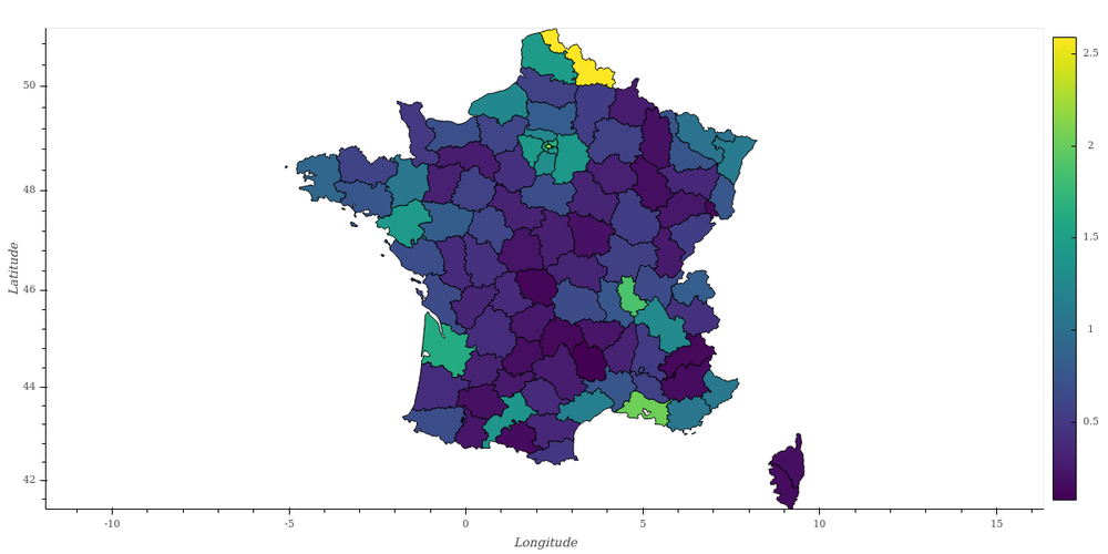
And we're now ready to plot the total population in each department! We also add the total number of men and women in the tooltips, by adding these columns to vdims. Also, please note how I rescaled the t_total color scale to display it in millions of inhabitants.
# declare how the plot should be done
regions = gv.Polygons(jf, vdims=['nom', 't_total', 'h_total', 'f_total'])
regions.opts(width=600, height=600, toolbar='above', color=dim('t_total')/1e6,
             colorbar=True, tools=['hover'], aspect='equal')
Conclusion
In this post, you have learnt:
- About the python visualization ecosystem, and how to get started fast;
- How to create your first maps with world geographical boundaries;
- Where to find definitions of geographical boundaries to make maps;
- How to connect your own data to geographical boundaries, to plot whatever you like.
If you know about open data sources for geographic visualization, please comment! I'd be very interested to learn about them.
Please let me know what you think in the comments! I’ll try and answer all questions.
And if you liked this article, you can subscribe to my mailing list to be notified of new posts (no more than one mail per week I promise.)
Learn about Data Science and Machine Learning!
You can join my mailing list for new posts and exclusive content: